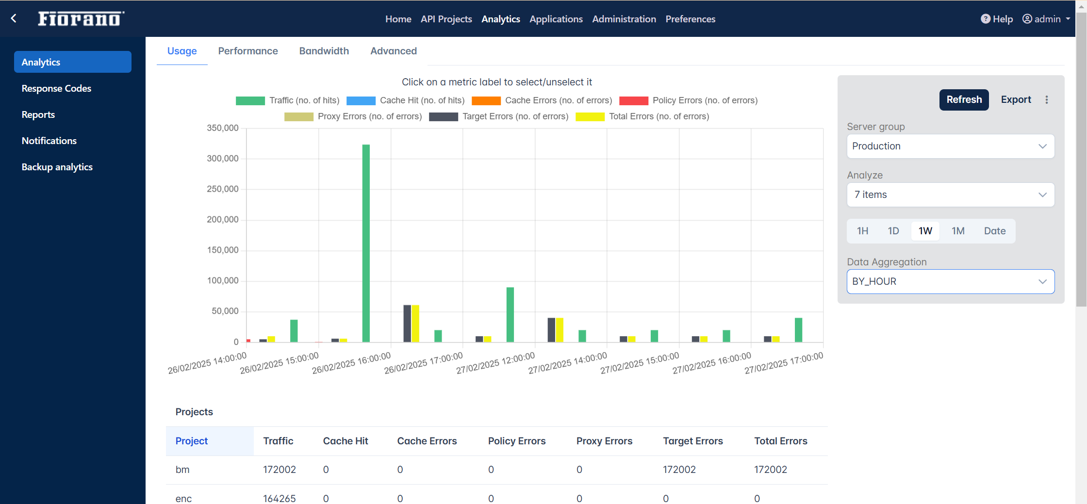
The graphical representation of reports that appear under the Analytics section can be customized from the Analytics tab under the Preferences section. The chart type can be switched between line and bar, and the tables for projects, products, and clients can be hidden from the report.
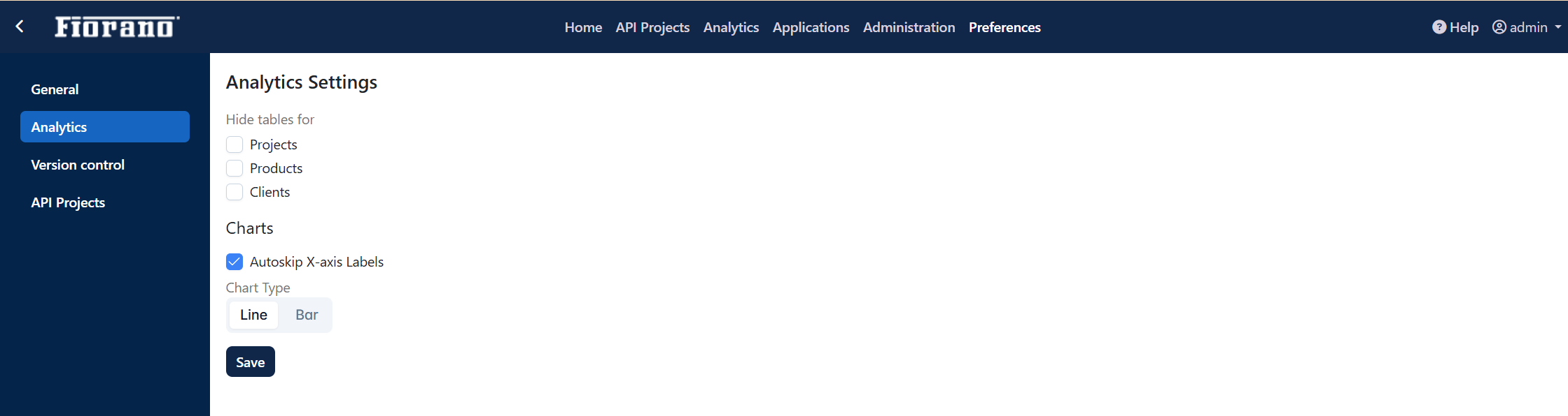
Hiding Tables
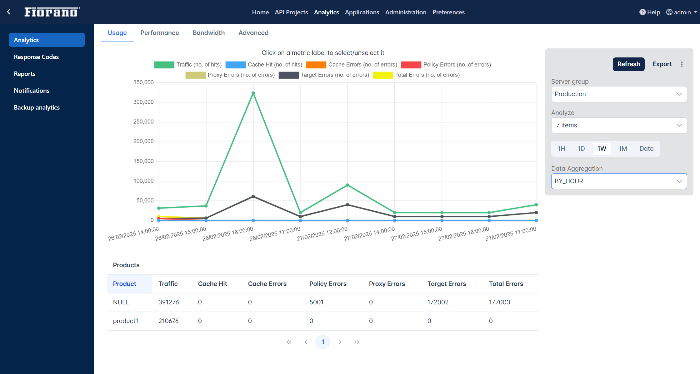
The tables below the graph in the Analytics section will have data for projects, products, and clients.
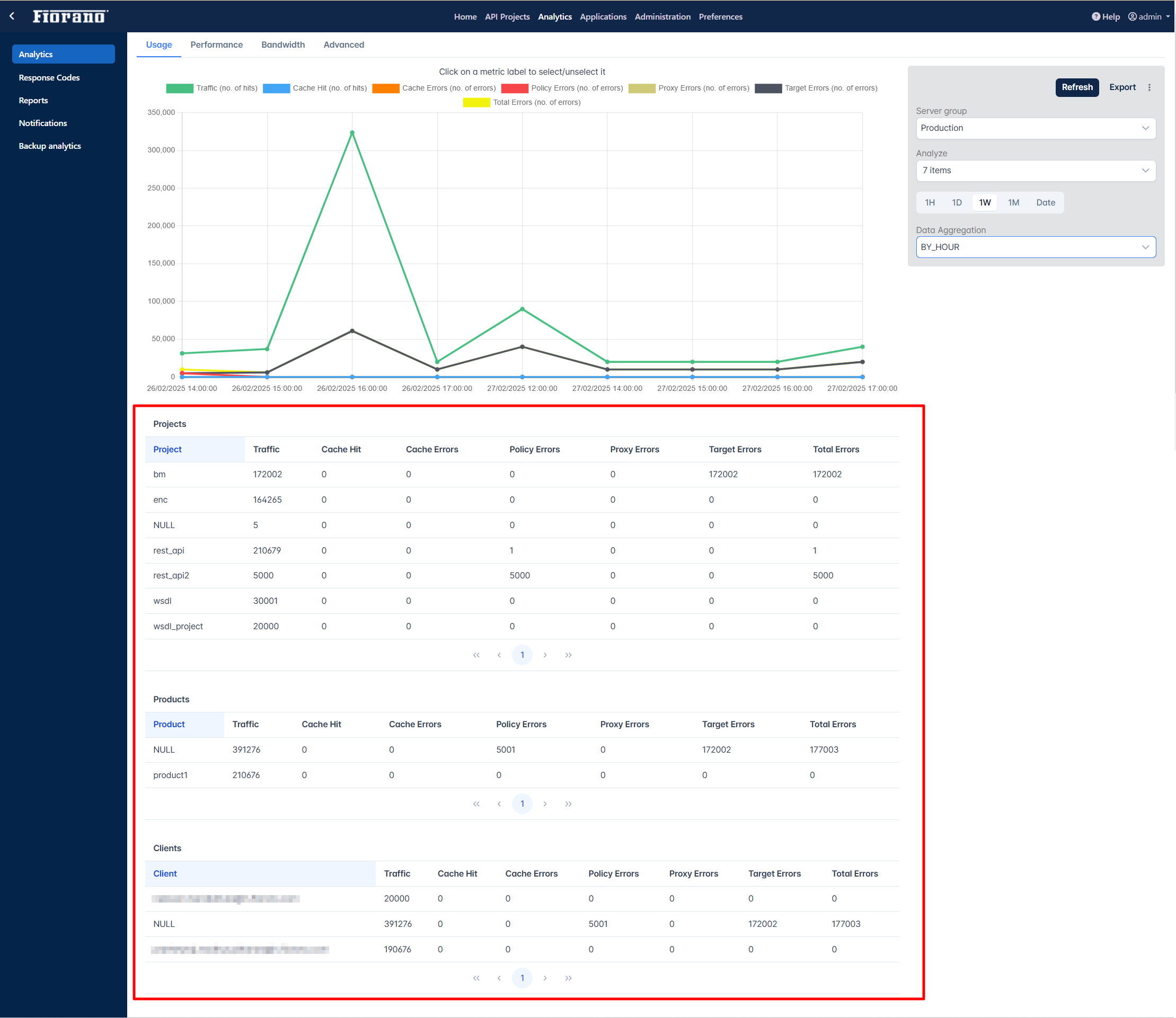
Select any or all options under the Hide tables for options as below to hide tables for the respective attribute(s) from analytics data:
-
Projects
-
Products
-
Clients
Click the Save button after selecting.
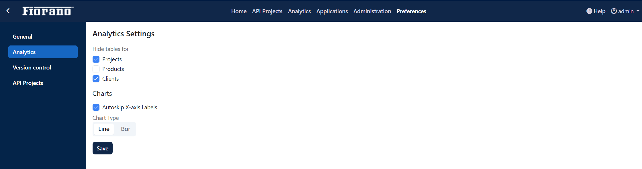
Go to Analytics section and generate a graph in the tab - Usage, Performance, Bandwidth, or Advanced where it reflects the change in table settings.
Skipping X-axis label
The Autoskip X-axis Label option will be enabled by default. Disable the option to display the X-axis label in analytical reports.
Changing the chart type
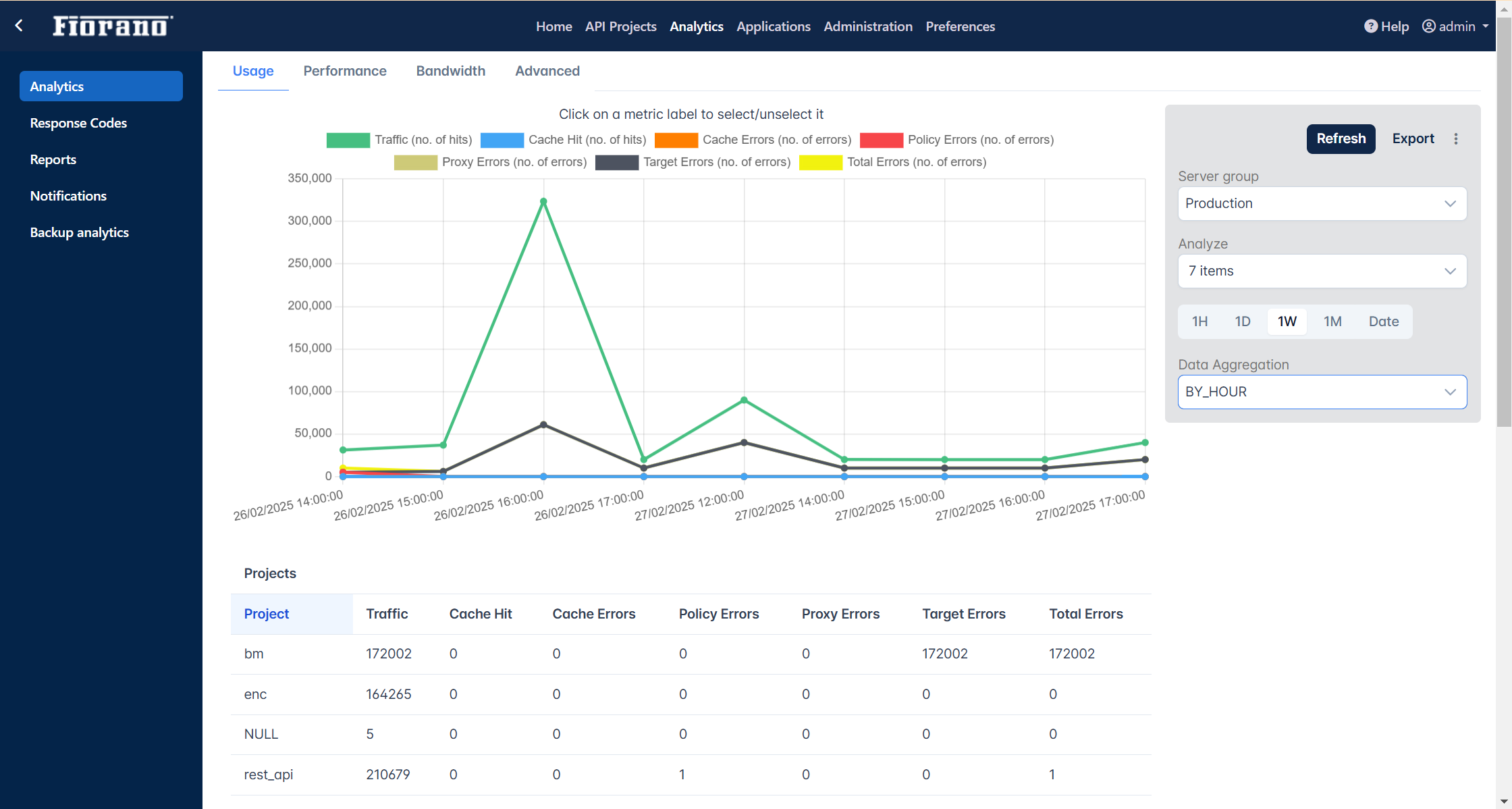
The default chart in the Analytics section is a line chart as in the figure below.
To change the chart type from the default Line graph to Bar graph, select the Bar option under Analytics settings in the Preferences section and click Save.
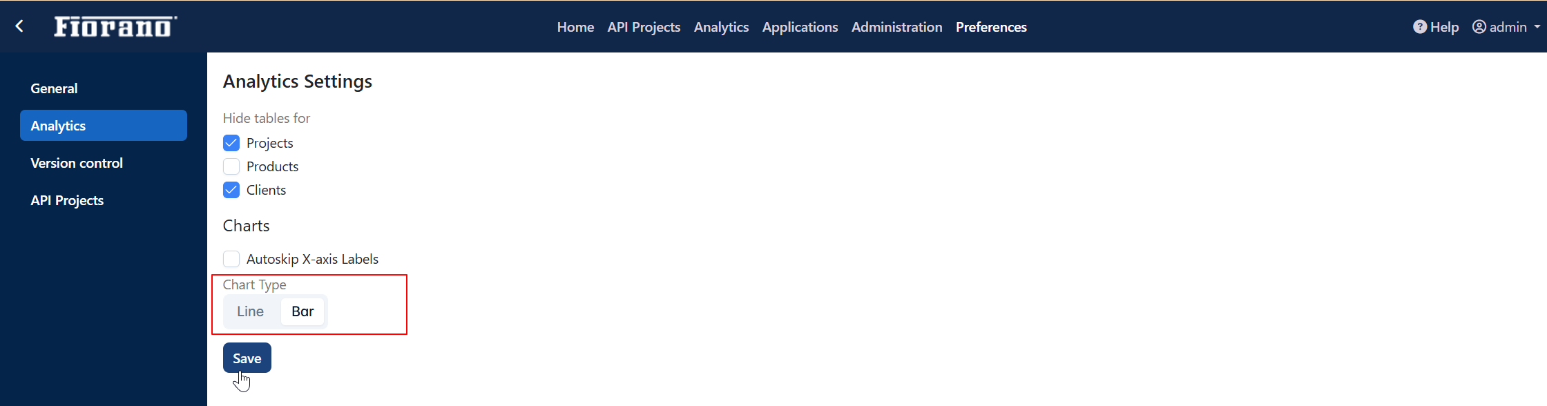
Check the Analytics section to see the chart type changed to bar.